UI/UX Virtual Seminar
Mar 30, 2022

As of January 2021, 59.5% of the total global population uses the internet. That translates to 4.66 Billion people, with 92.6% or 4.32 Billion of those accessing the internet on mobile devices. That’s a lot. That’s also why new areas in the development of the online world are steadily gaining momentum.
The field of User Interface and User Experience design is not a new one, but it is something that is becoming increasingly essential as the need to improve the online experience is at an all time high. That’s why at ISI, we conducted a Virtual Seminar about UI/UX to further educate everyone about this very exciting topic. Intended for the Quality Assurance team, led by Engr. Billy Ladao, the seminar was opened for anyone interested as the topics that will be discussed would benefit anyone working online. Conducting the seminar was Mr. Clyde Valcorza, ISI’s very own UI/UX designer who has had years of experience with the field.
The seminar started with an overview on what would be the key takeaways which included an overview of what User Interface and User Experience design is, strategy and content, wireframing and its different types, and finally the Poka-Yoke design principle.
According to Mr. Valcorza, User Interface design is how we transfer brand strength and visual assets to a product's interface. The interface will in turn be a tool on how we improve the User Experience. UI is basically all about the look and feel, the responsiveness, and interactivity. This might sound easy, but it actually has a lot of research and considerations behind it including brand colors, fonts, images, iconography, the definition of user guides and story lines, and making sure that the design of the interface is adaptable to different platforms such as mobile and desktop.
As a short illustration on how UI/UX is reflected in day to day items, Mr. Valcorza discussed the ketchup bottle. The addition of branding elements, the redesign to be upside down, and using a squeezable material is a prime example of improving user experience. He then proceeded to have a little activity where participants had to look for items in their surroundings that were turned upside down and talked about how this small change drastically improved the usability of the product.
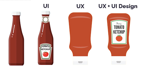

Going deeper into the meaning of User Experience Design, Mr. Valcorza says that the process of enhancing customer satisfaction and loyalty by improving usability, ease of use, and pleasure in the interaction between customer and product is the essence of UX. As with the activity, those products that have been turned upside down are far easier to use, and you get every last drop of product!
UX sounds very clear and simple but there’s actually a lot of hard work behind these decisions. As Mr. Valcorza puts it, the process is divided into Strategy and Content and Wireframing and Prototyping. In Strategy and Content, the designer needs to consider what the customers are doing. It might include competitor analysis to check what trends have been successful for companies with similar products. Customer analysis which could include surveys, market research, creating personas of the target market. And finally product strategy, considering all what you have learned from the analysis stage and coming up with your own brand’s next move.
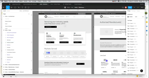
Once strategies have been decided upon, it’s now time for designers to create low fidelity wireframes. Wireframes are the bare bones schematic or blueprint for the placement of visual elements of a website or app. They are basic shapes and for the most part do not include any color. Taking only in consideration the placement of images, text boxes, buttons, fields, and other parts of the website. These wireframes are then tested where the ones with the most positive reactions move forward in the process and the designer makes iterations based on results.
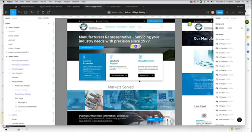
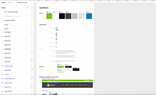
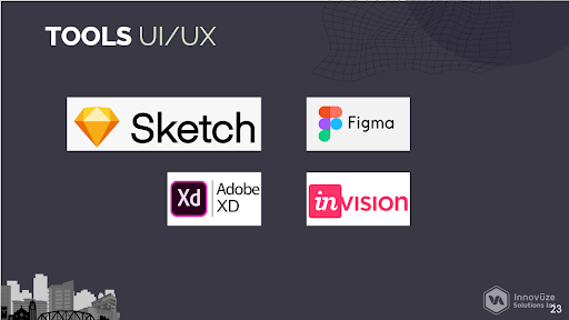
Mr. Valcorza shared screenshots of what the low fidelity website is versus the high fidelity sample. As one sees, the base form is there but now we can fully appreciate the design of the website that includes the assets as well as some changes in the design. Also, when one wants to explore the world of UI/UX it is important to be familiar with the tools in the industry and here are some examples of the most popular ones that industry professionals use day to day.
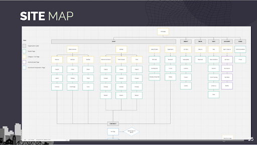
Another very important aspect of User Experience is the Site Map, or the hierarchical representation of the website that shows how pages are prioritized, linked, and labeled. It is essentially a “bird’s eye view” of the website. This might seem confusing at first, but it is essential that UX designers be familiar with this concept as it allows for the designer to see how a potential user would navigate the site. How easy or difficult it is to navigate your website greatly affects how a user will feel while using the site. Will they find what they are looking for? Will they get lost, get frustrated, and just move on to the next website? Will continuing to browse be an enjoyable experience? Those are the very questions that every UX designer must ask.
At this point, Mr. Valcorza introduces the participants to what is called the Poka-Yoke UX Design principle. A concept that was formalized by Shigeo Shingo for the Toyota Production System, the principle focuses on trying to eliminate product defects by preventing, correcting, or drawing attention to human errors as they occur. Essentially, what Poka-Yoke does is to create the right conditions before someone moves into the next step, anticipating possible errors, and providing a setting where these errors cannot not occur. Poka-Yoke has a few guiding principles and they are:
-
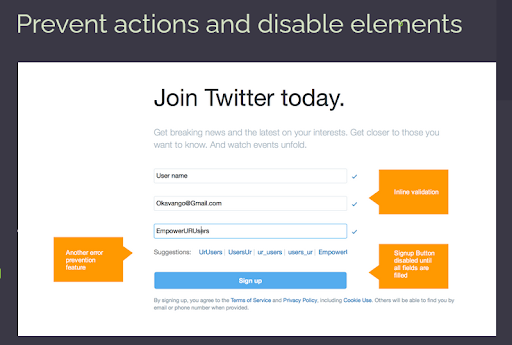
Preventive actions and disable elements - disabling elements until all conditions necessary have been met such as disabling a “Continue” button unless all input fields have been filled.
-
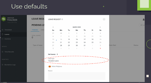
Use defaults - when an element has multiple choices, providing a default value that is most common can help a lot in error prevention.
-
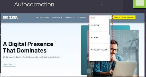
Autocorrection - not having to interrupt a user with known errors that can be autocorrected. A great example of this would be the auto spell check when creating documents on MS Word or Google Docs.
-
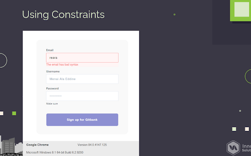
Using constraints - providing limitations to only acceptable inputs is another way to prevent errors. This could mean only numerical inputs, not allowing special characters, or formatting.
Finally, equipped with all they’ve learned from the seminar, Mr. Valcorza facilitated an activity where participants would give feedback to ISI’s very own time keeping application. How was their experience so far, what were their favorite features, what needs improvement, and did they notice any errors? A great activity to think like a designer, the participants set off with much gusto!
As the activity progressed, it was quite remarkable that each one had their own little issues and favorites! Mr. Billy Ladao, the QA team lead, collected the feedback that was given by the participants. And here we see how the “testers” expressed their thoughts. Some of the feedback that were gathered was the desire for a CC feature that could notify PMs or other team members when filing for a vacation leave, a way to add favorites for clients under task logs, and also someone added that it was a “pet peeve” of his with the way Vacation Leaves were labeled. Mr. Lionel Amarado, the General Manager of ISI, also shared his thoughts on how approval of leaves and OT on the tracker app is a little confusing as the Update button does not approve it but the final approval is hidden under more options. Other feedback included a summary of all leaves during a quincena, removal of read notifications, not being able to copy projects from previous weeks, and reorganization of logged tasks to be chronological.
The activity was a huge success as everyone put their ‘tester hats’ on and had to really think about what features are good, what can be improved, and what can be added to the tracker app as it is an essential part of the ISI employee’s working day. At the end of the activity, Mr. Earl Jaducana was awarded a prize for providing the best feedback from the activity. Mr. Valcorza thanked everyone for their enthusiastic participation, and Mr. Amarado thanked everyone as well, saying that this training was very useful for the QA team, Developers, and Project Managers. Highlighting the importance of UI and UX, and how avoiding issues will positively affect the users, the success of the company, and the of clients.